Three’s a charm.
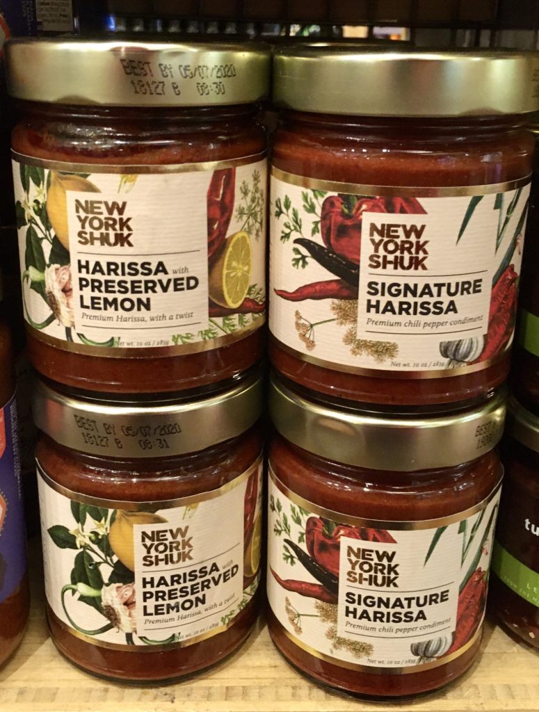
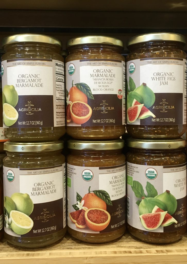
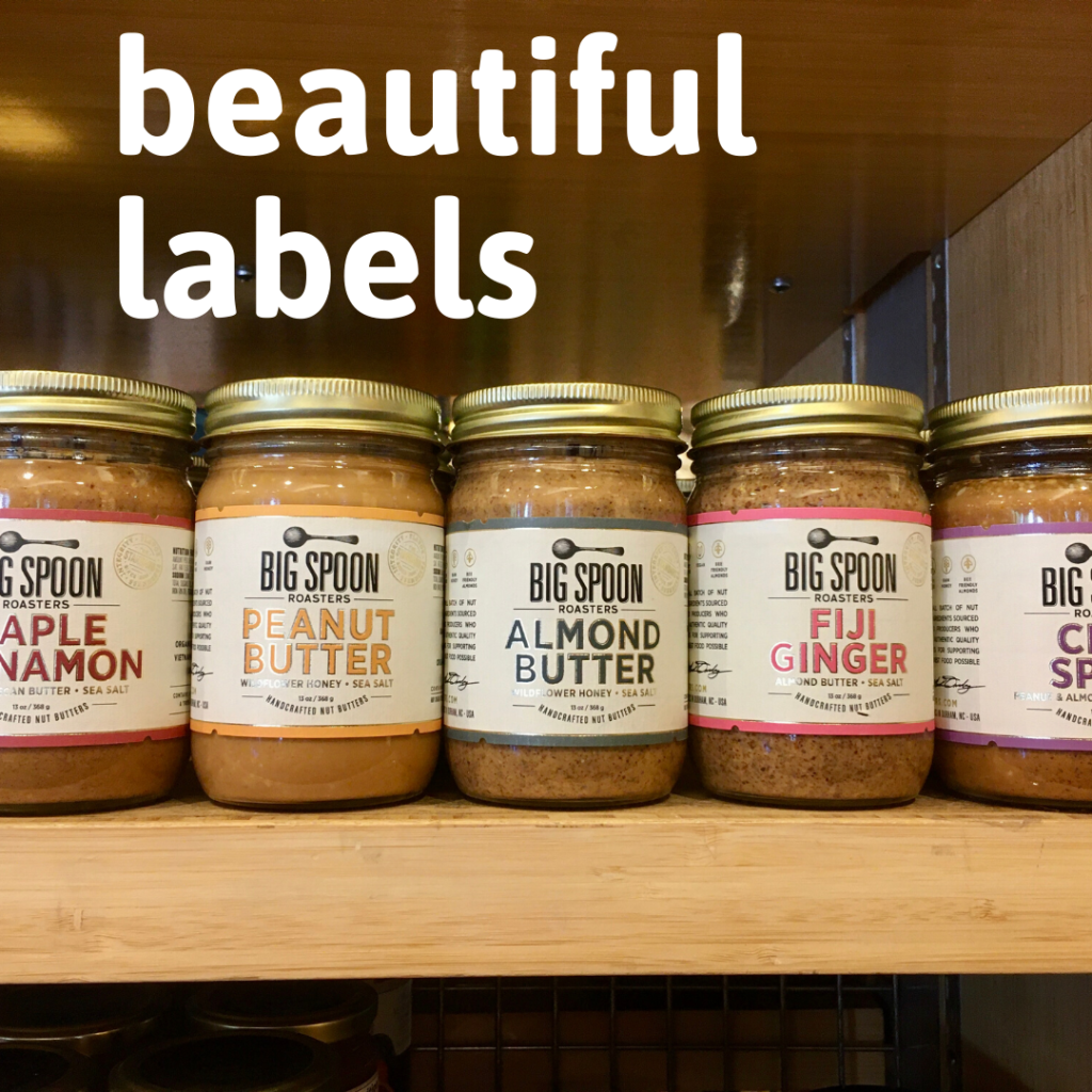
Within one week, while working at Market Hall Foods,, I noticed a nice label design trend on jars from nut butter makers Big Spoon Roasters, condiment makers New York Shuk and organic preserve company Agrisicilia.
They’re all so beautiful I can just see stacking these right on your counter or table rather than hiding them in a cupboard.
What these timeless label designs all have in common:
- Lovely metallic gold ink touches
- Beautiful illustrated food imagery
- Easy to read typefaces that also have a certain charm
- Classy matte finish (not glossy) for the label paper stock
That last thing is the only downside. You probably know that matte paper sucks up liquid. Labels can get dirty in all sorts of ways, during labeling, at the store and definitely at home.
Still, they are simply gorgeous and, as you can see, caught my eye!
What do you think?





They’re all very pretty. I’m asking myself out of the three which I would take home with me (food preferences aside).
My vote is for the Big Spoon Roasters almond butter. I think they achieved a nice blend of simplicity and personality.