The 2020 Winter Fancy Food Show featured some incredible new foods and enhancements to old favorite. (Here’s my wrapup.)
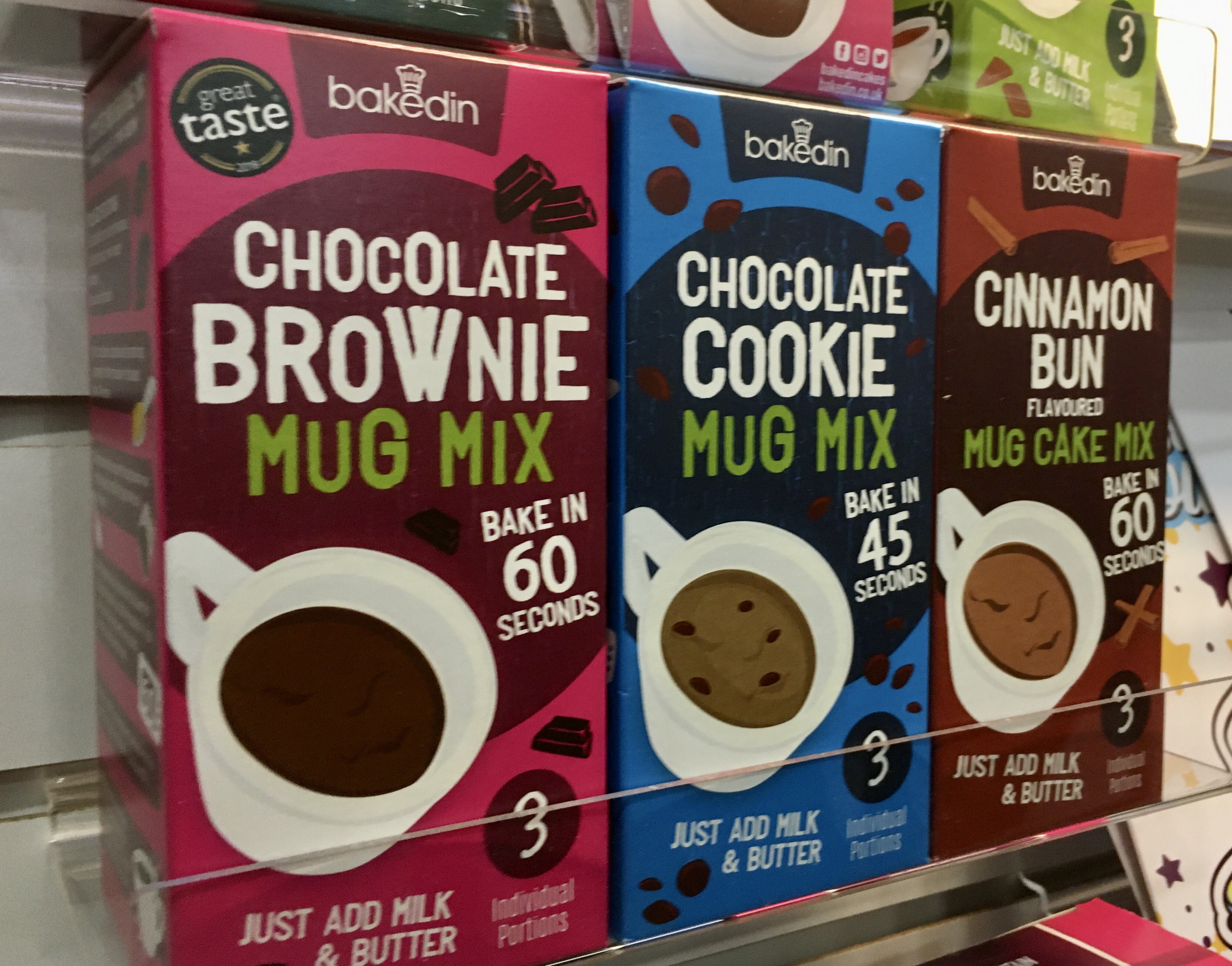
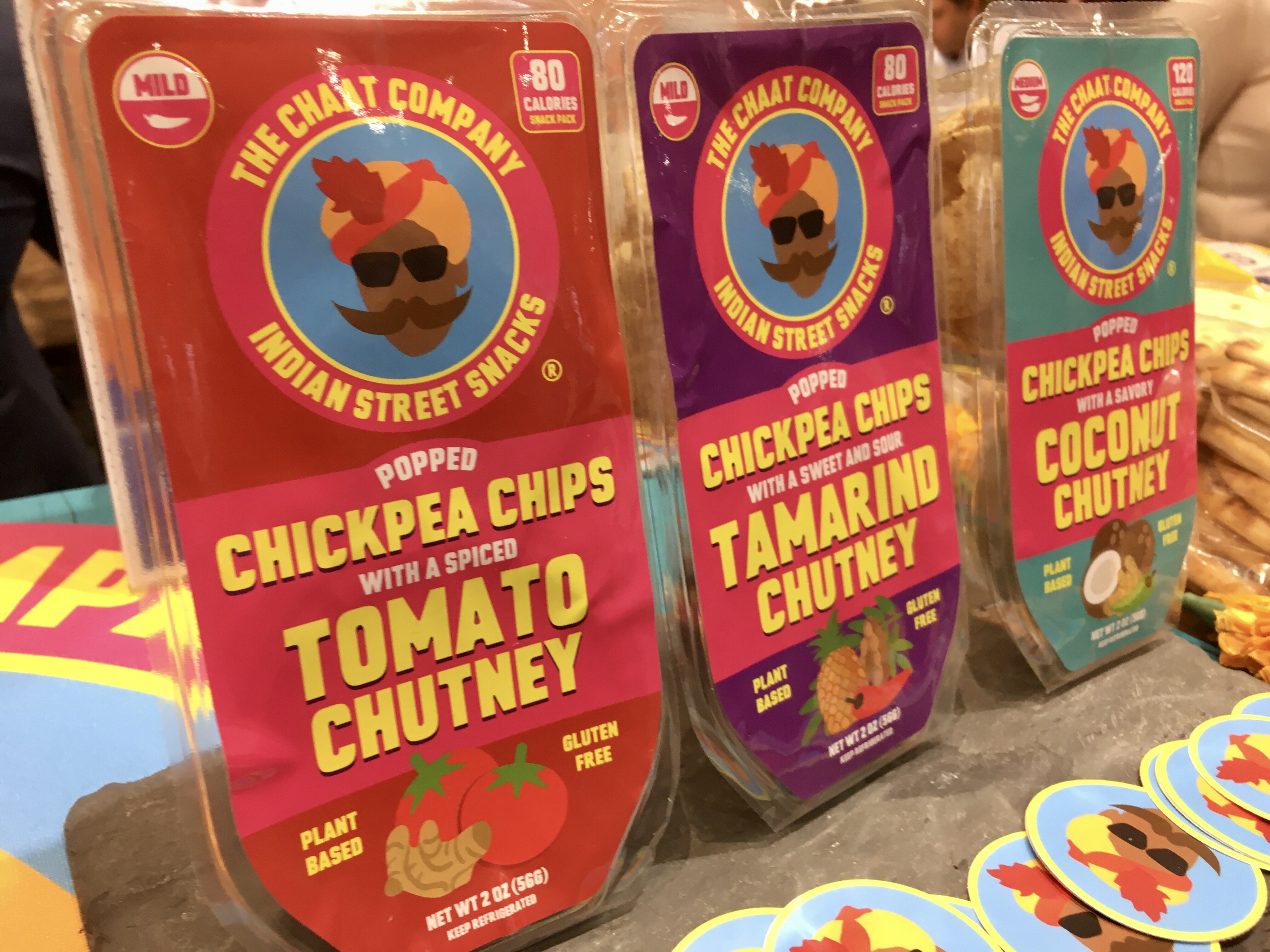
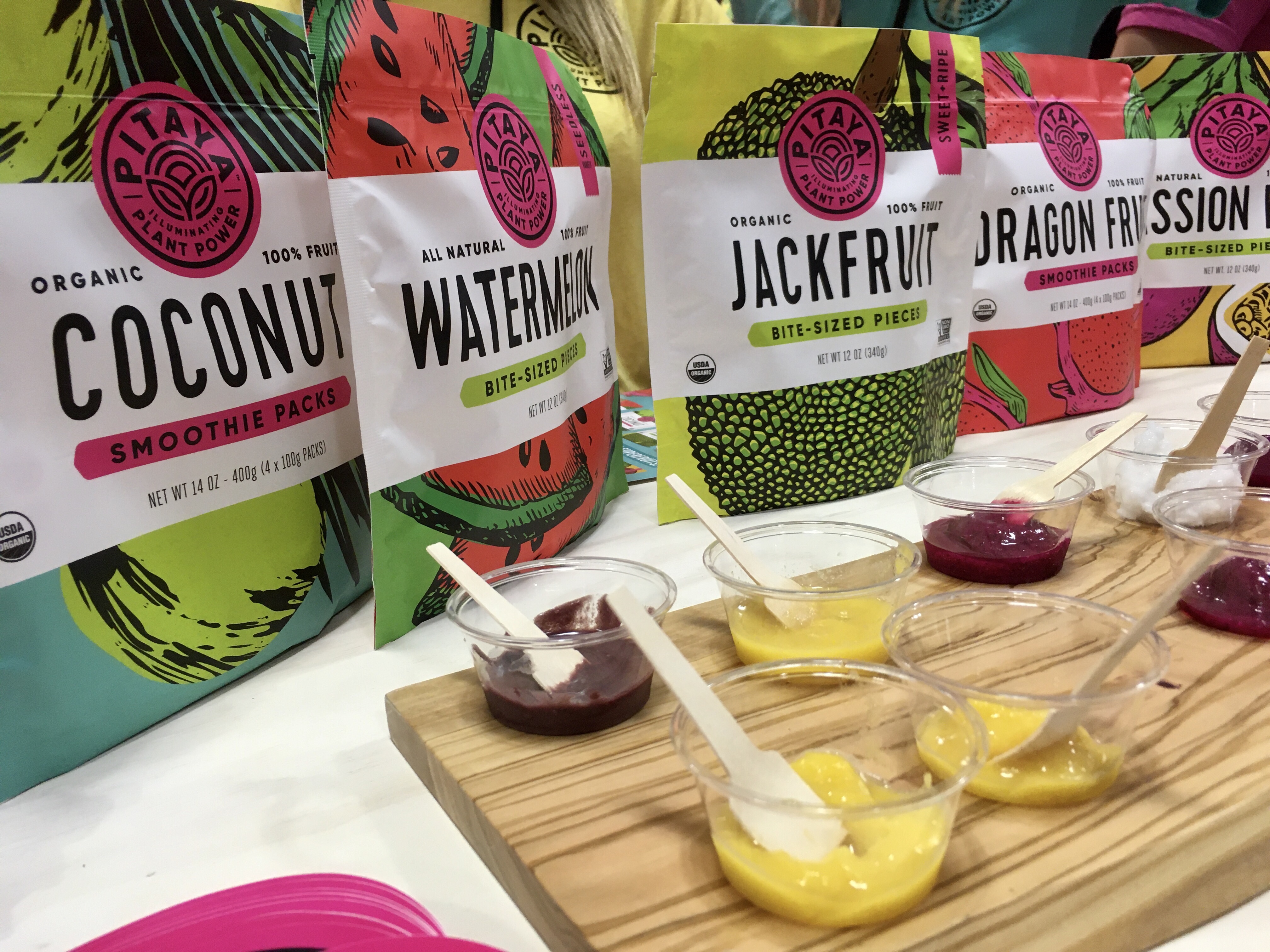
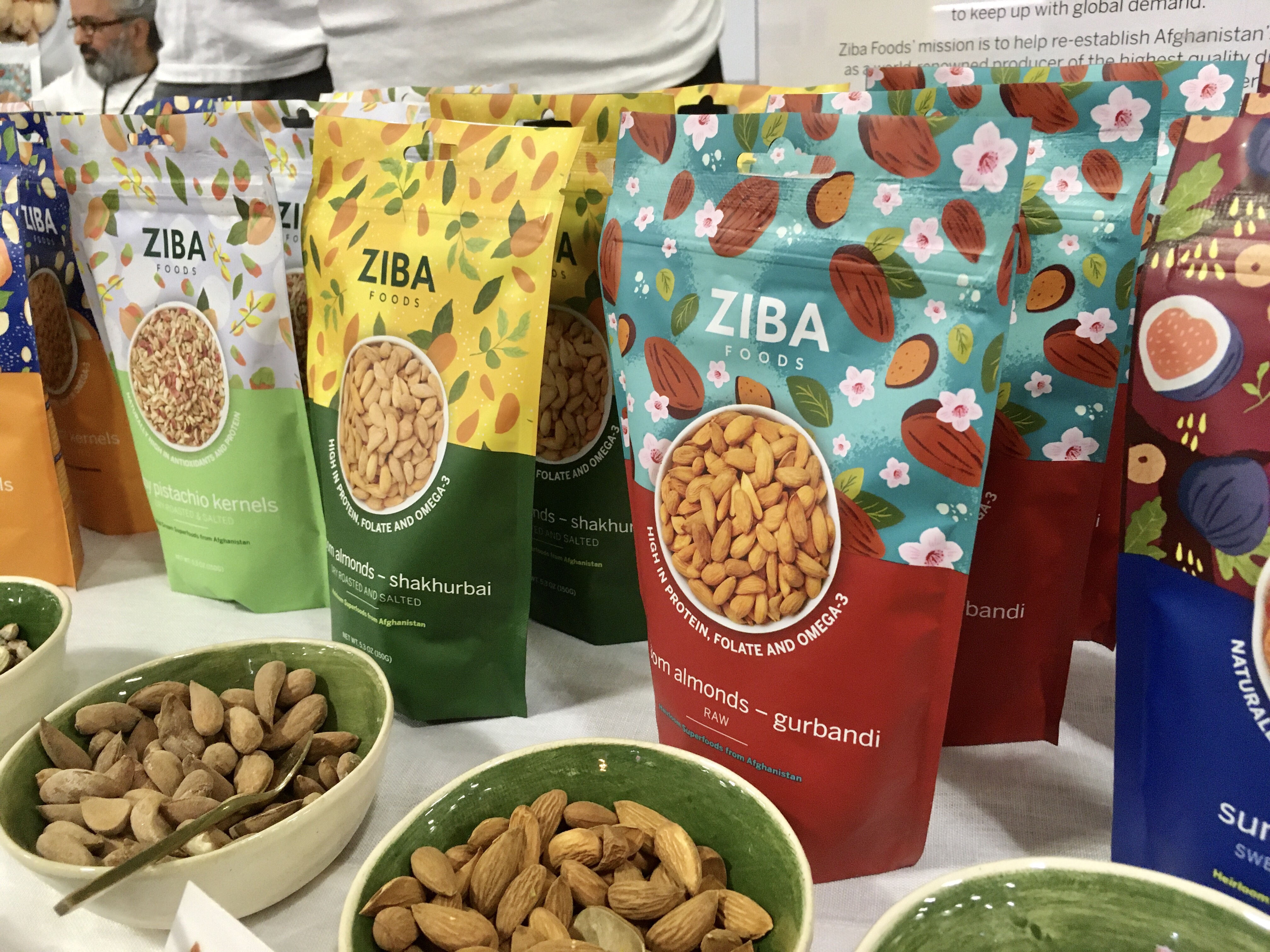
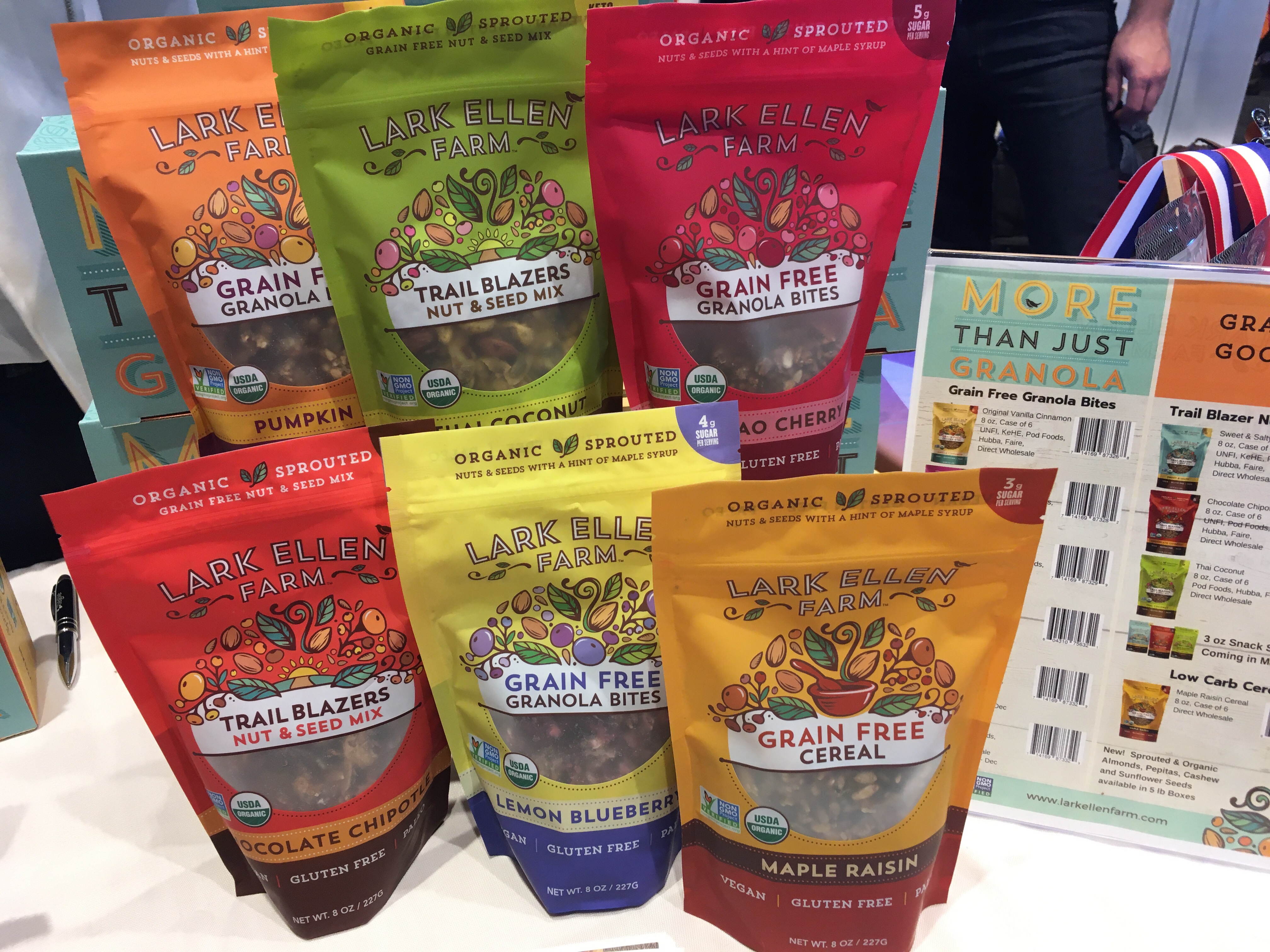
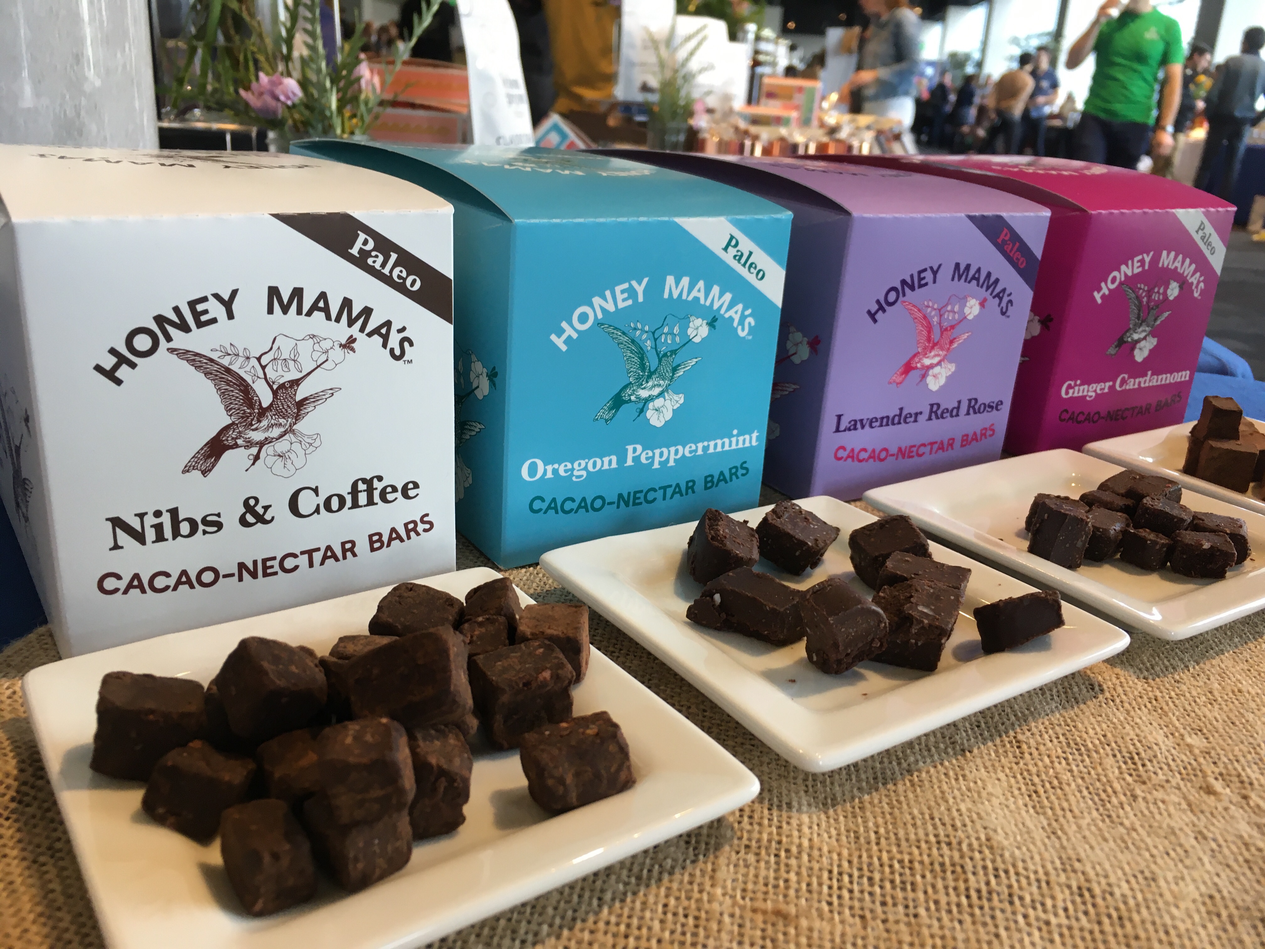
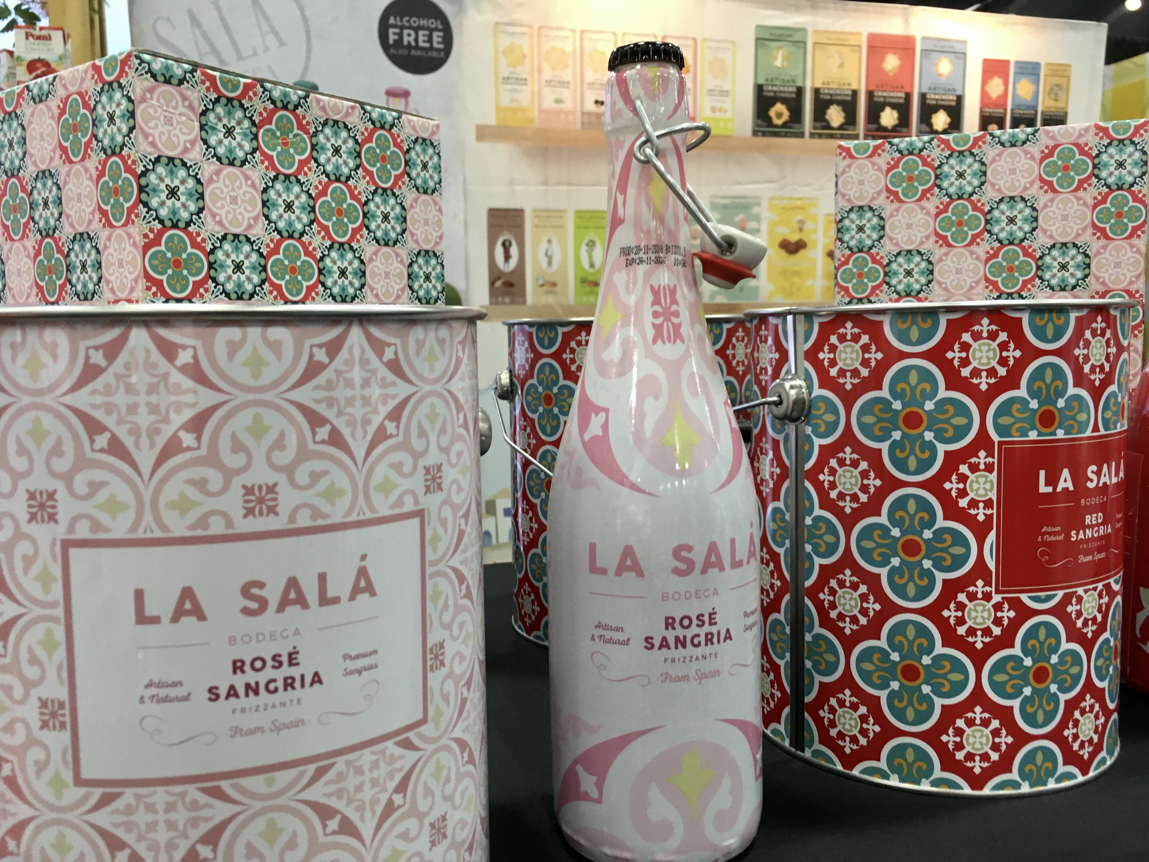
Noticing food packaging trends is almost more fun to me than what’s new with the foods, especially because it’s often the packaging that gets people to buy.
A few years ago food packages were minimalist — white, with a simple picture of the food inside, perhaps inspired by Justin’s and the quest for “clean.” The vintage illustration held its own for a few years. Then there were the omnipresent bold, narrow, sans serif fonts of last year. (You’ll see my picks drew upon all of the above looks!)
In 2020, rich, vibrant colors and lush illustrations of the ingredients within are all the rage, often with that paper-cutout look.
What mystifies me is how many brands end up with similar package themes. Every year. Except for brands such as Stonewall that are so unique and well-established in their look.
Is this what happens when graphic designers all read about the same trends? Inquiring minds want to know?!
It’s fascinating to look at the chocolate bar aisle. Fascinating, in a noisy way. The brand Xauxa — makers of organic, vegan chocolate — breaks away from the “mold” with sexy-as-hell illustrations worthy of a museum wall. Those Italians.
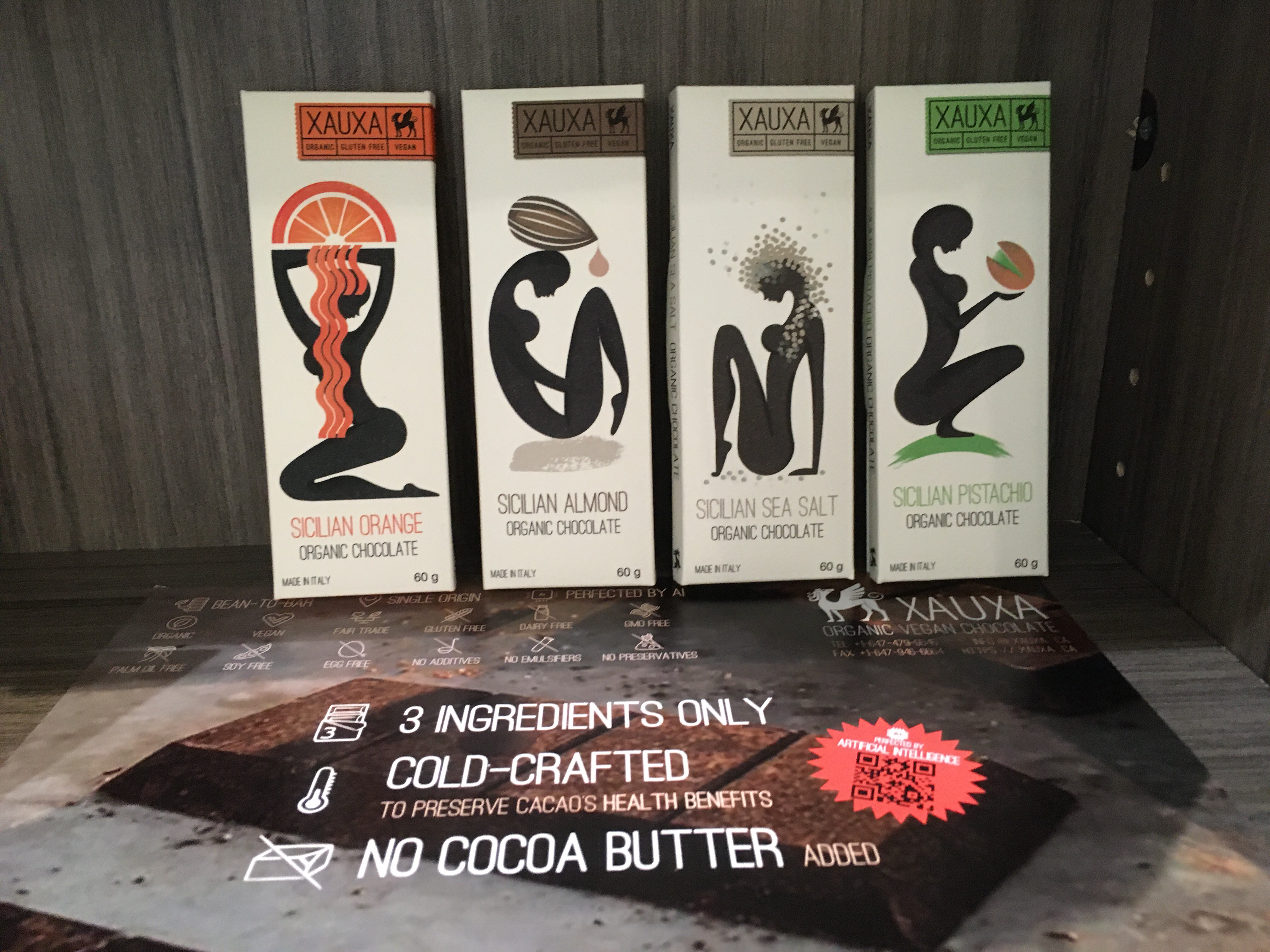
Just “wow.” Such stunning package design rarely comes along. Of course, it’s made in Italy.
